STORE WINDOW/ COMMERCIAL STYLING
(School project 2019)
Collections: PURPLE RAIN, SPACE ODDITY & BEALLARA PURPLE HAZE ORCHID are a variation of three different sets of outfits within one theme/collection.
I took inspiration from my all-time style and music heroes for these three collections: Prince, David Bowie & Jimi Hendrix. I wanted to play a tribute to their fearlessness and androgynous style. I believe they opened the door for cultural change that we also observe in fashion.
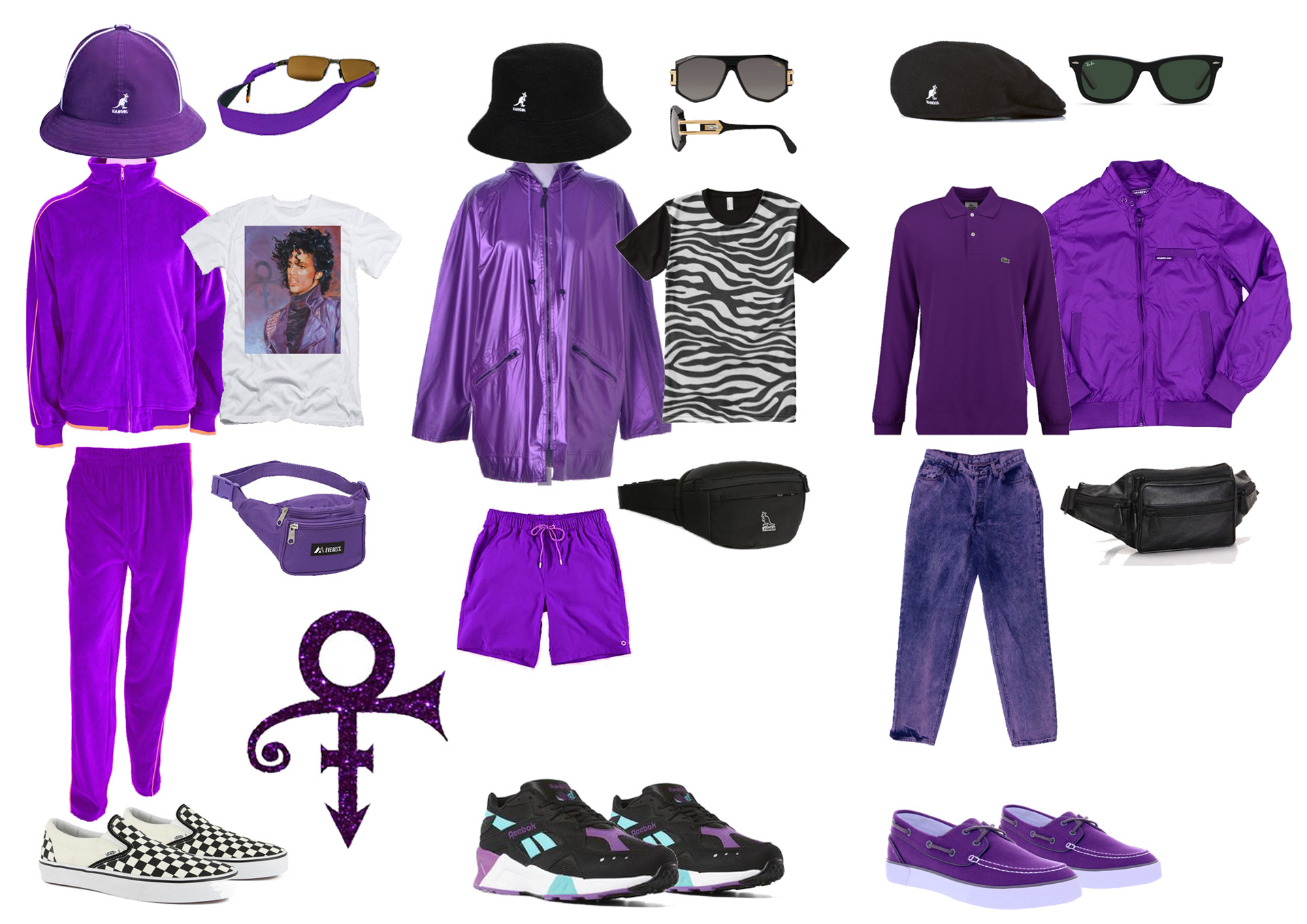
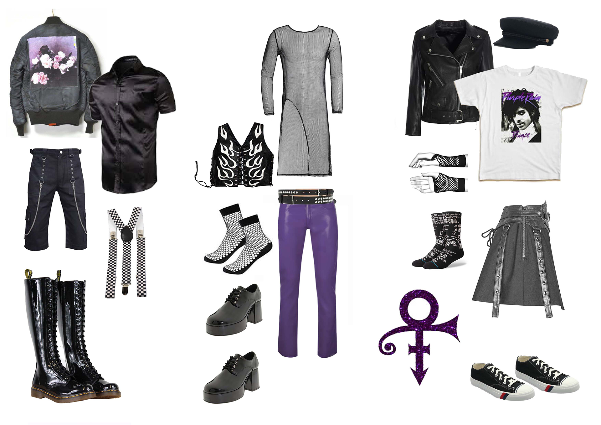
PURPLE RAIN COLLECTION
I picked the color purple, which isn't considered a masculine color for menswear, and played with the idea of using "feminine" fabrics and patterns. In this collection, I was inspired by the 60s, 70s, and 80s fashion trends.
For the first set of outfits, I used a Buffalo hat from Vivienne Westwood's Autumn Winter 1982-83 collection called 'Buffalo Girls (Nostalgia of Mud) as a theme element.
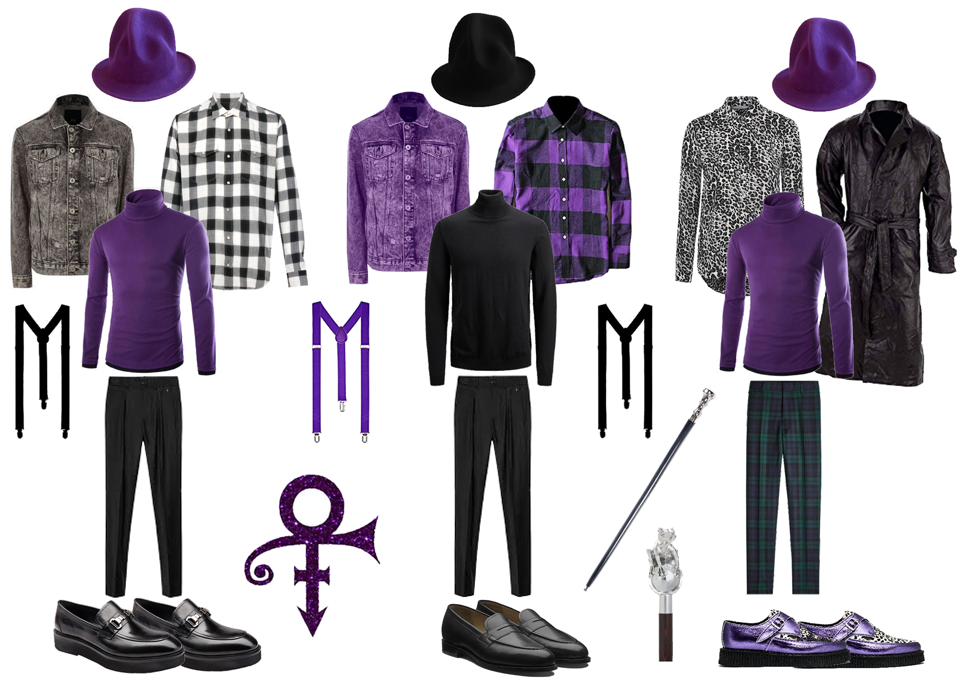
The 80s hip-hop, street style-inspired outfits. The joining element was a Kangol hat.
The 70s and 80s fashion inspired set.
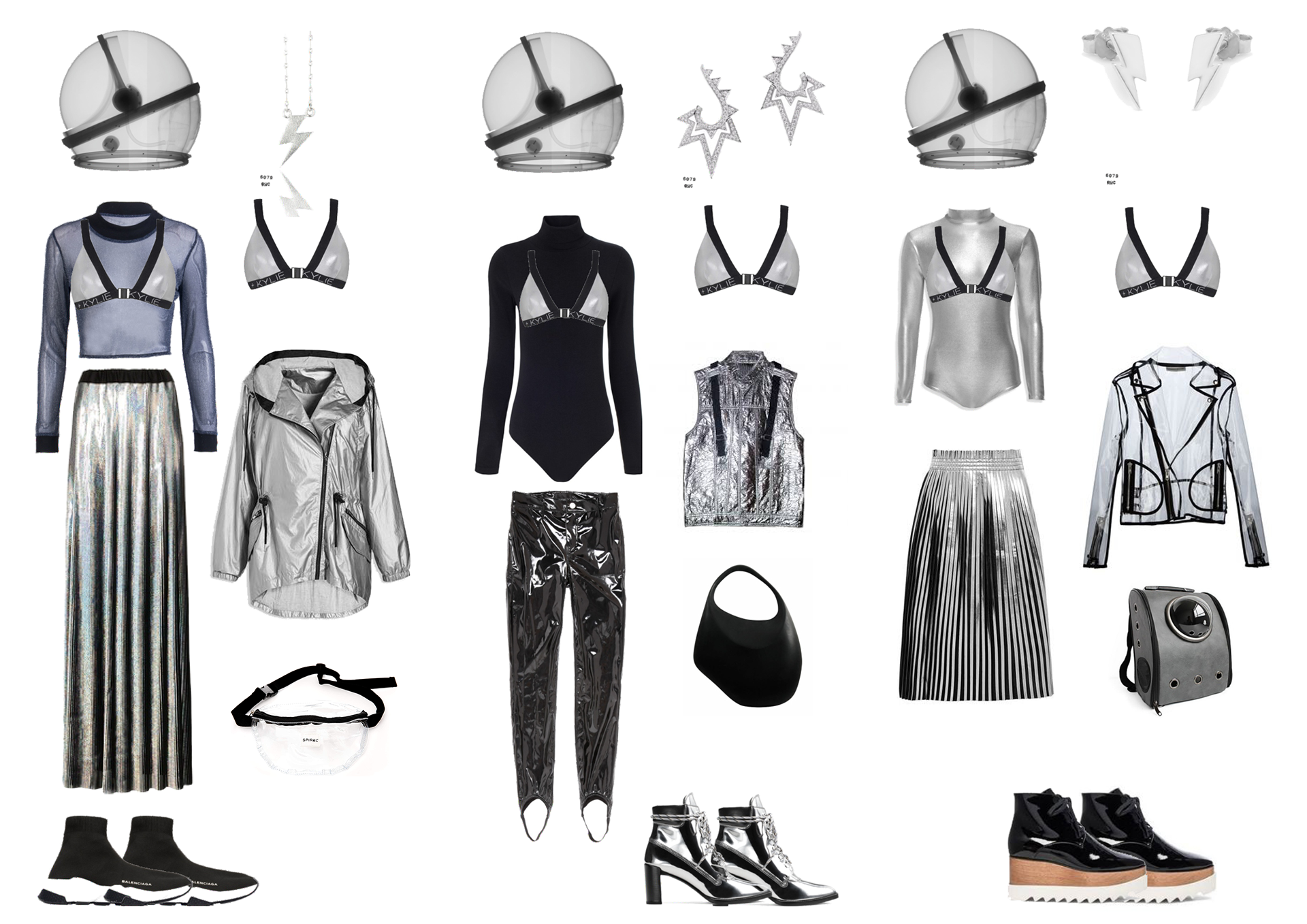
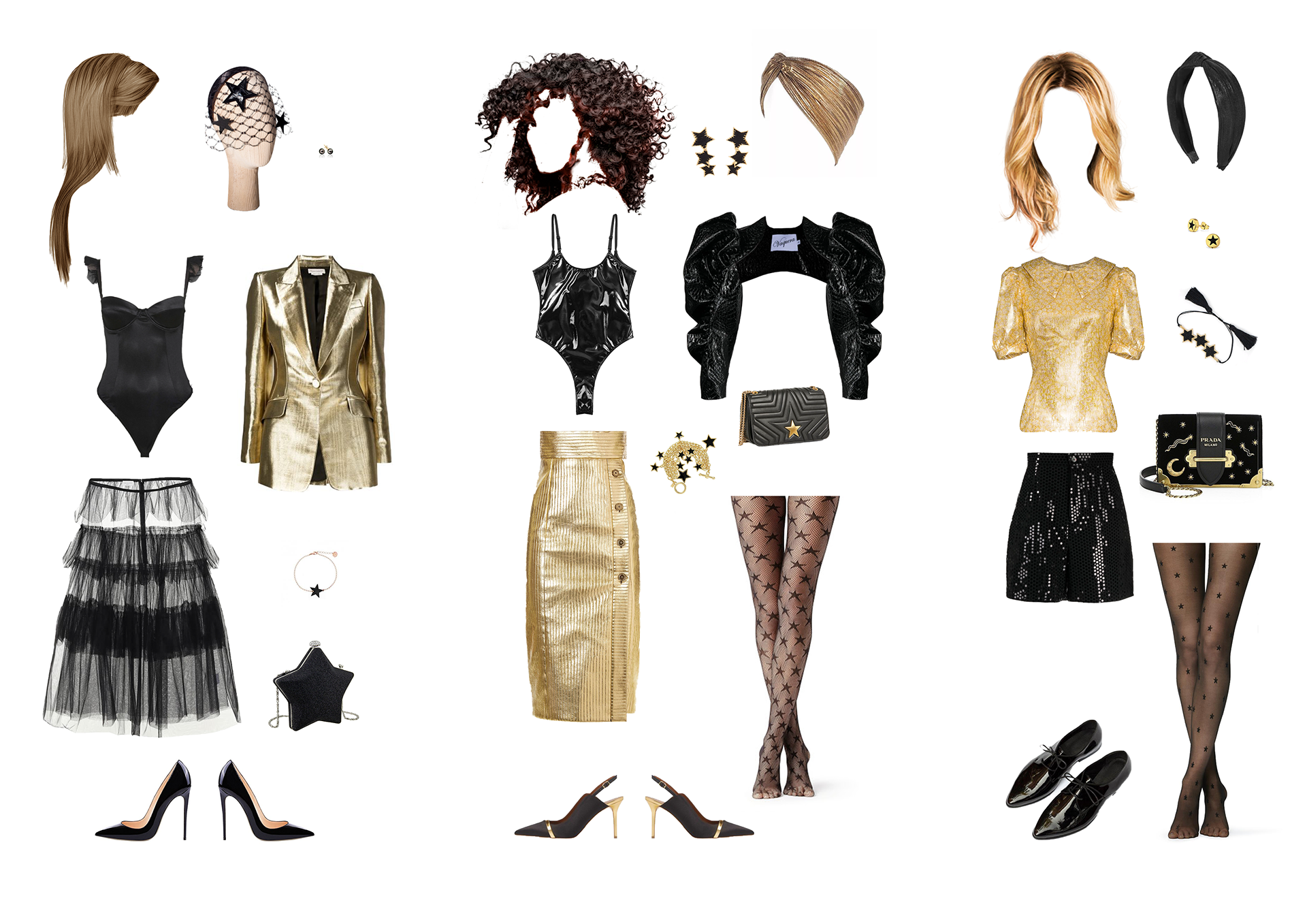
SPACE ODDITY COLLECTION
The sets in this collection were inspired by David Bowie and the romantic take on cosmos and space.
I picked an oversized retro astronaut helmet for the theme element.
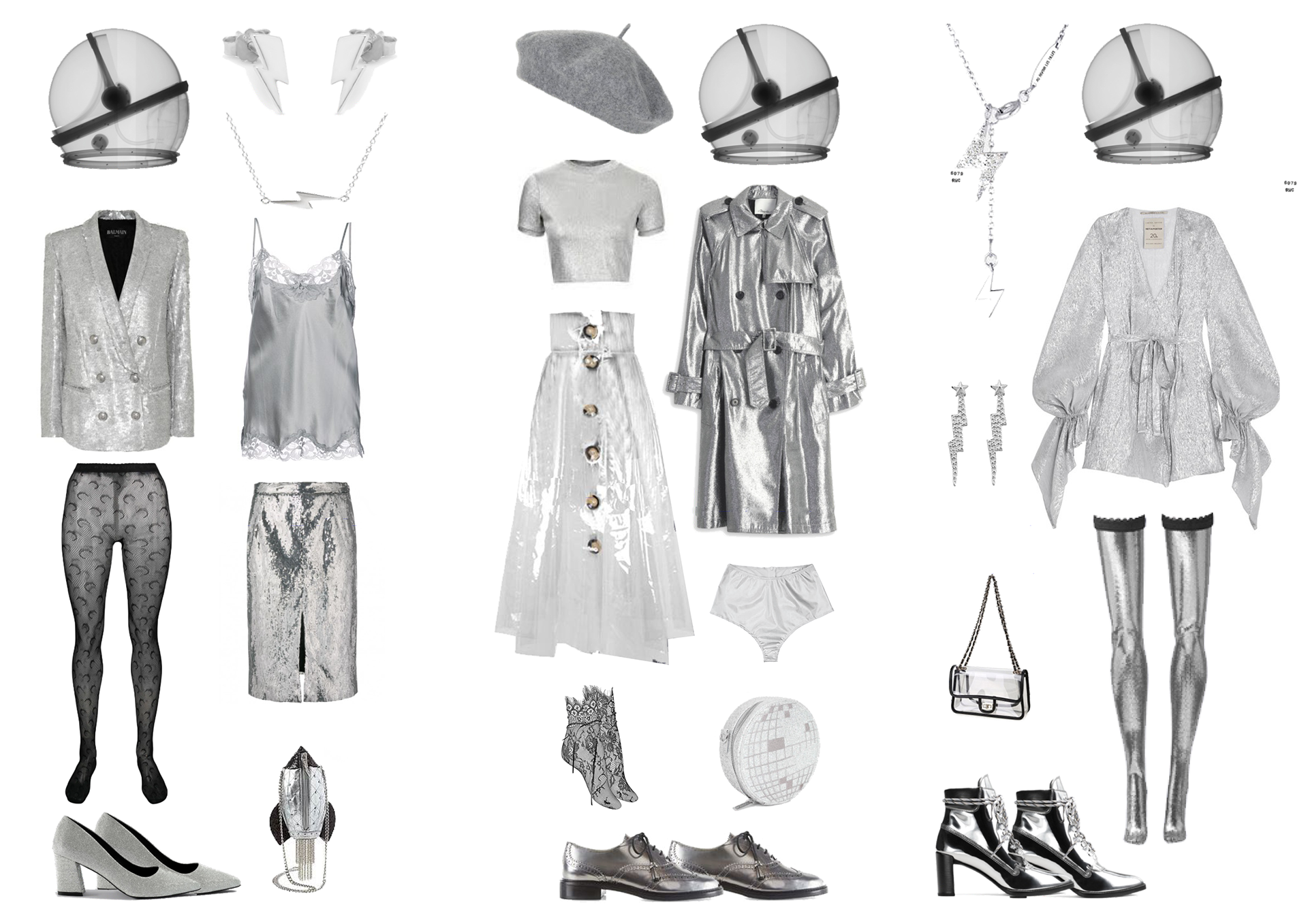
I picked a plastic over-top bra for the joining element and a helmet as a theme item for the second set.
The third set, David Bowie-inspired "Lady Stardust." I used stars as the theme element.
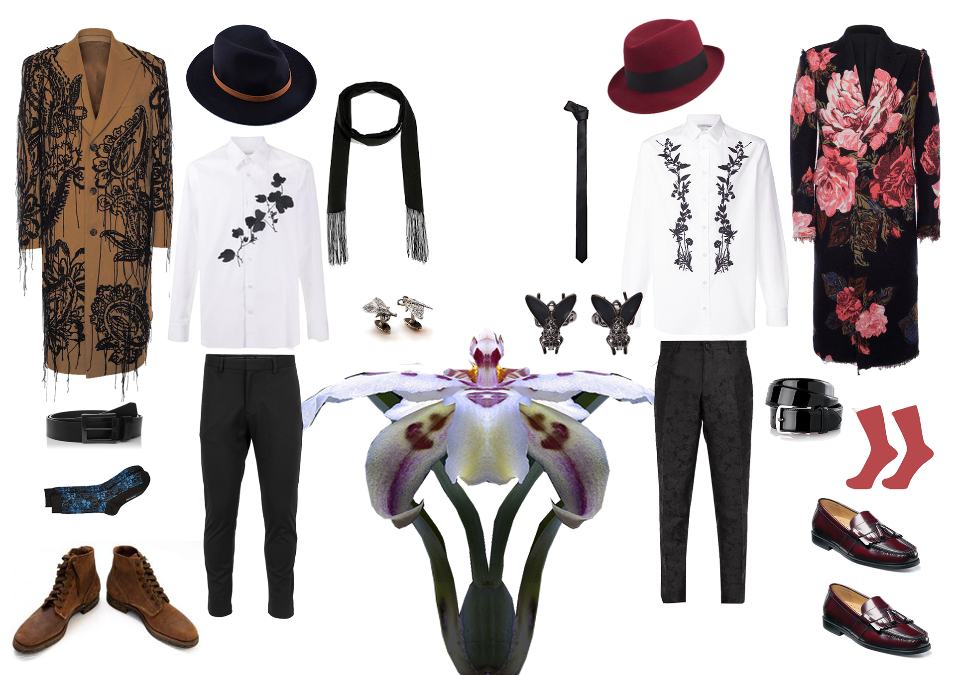
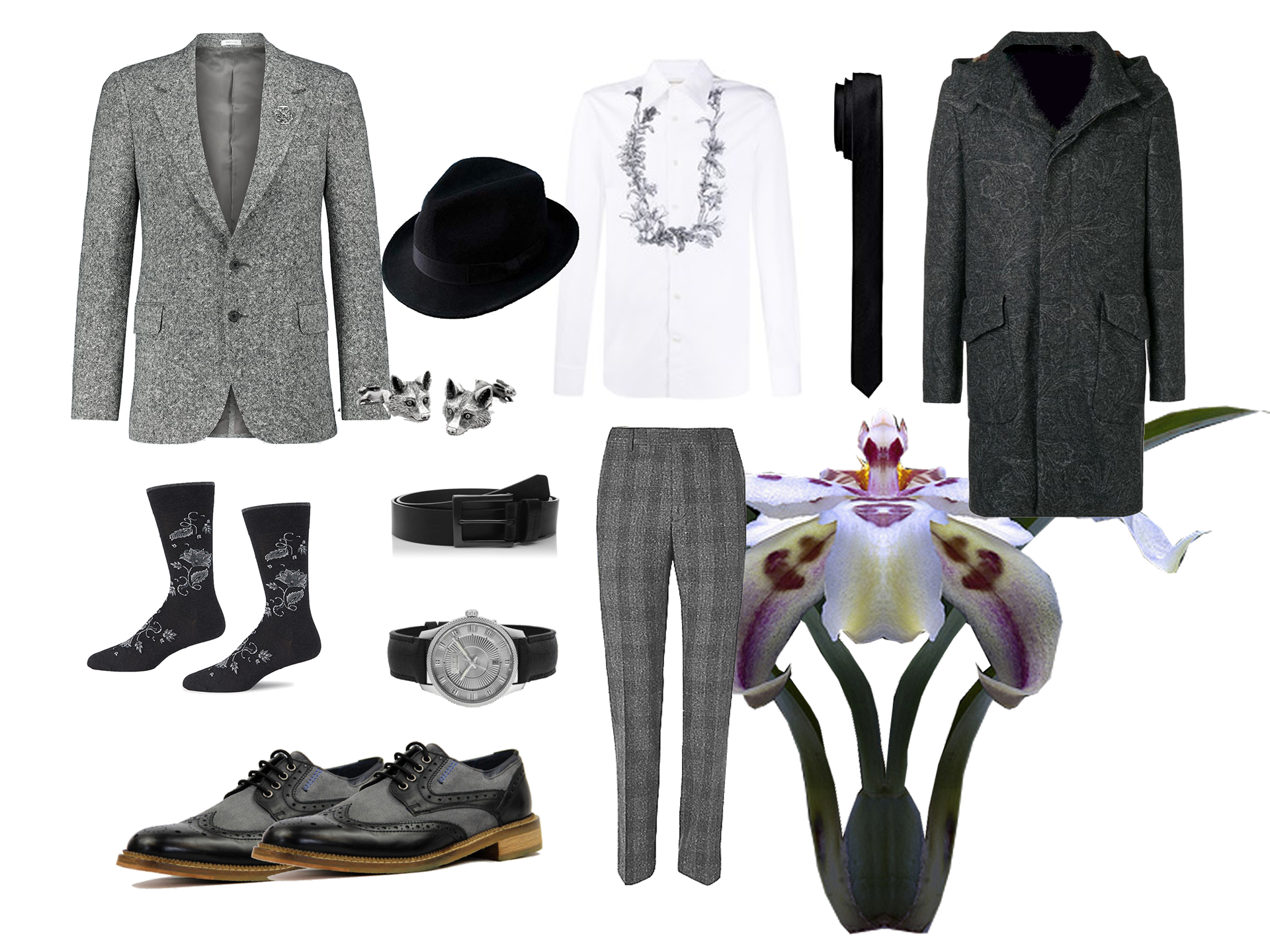
BEALLARA PURPLE HAZE ORCHID COLLECTION
Beallara Purple Haze is an orchid named after Jimi Hendrix.
The inspiration for this collection was a bit different take on "Flower Power." Jimi Hendrix had his breakthrough in the UK, so I wanted to nod to British gentleman fashion but keep it playful and not ordinary looking.
The inspiration for this collection was a bit different take on "Flower Power." Jimi Hendrix had his breakthrough in the UK, so I wanted to nod to British gentleman fashion but keep it playful and not ordinary looking.
Firs set: casual "flower power," looks for a man.
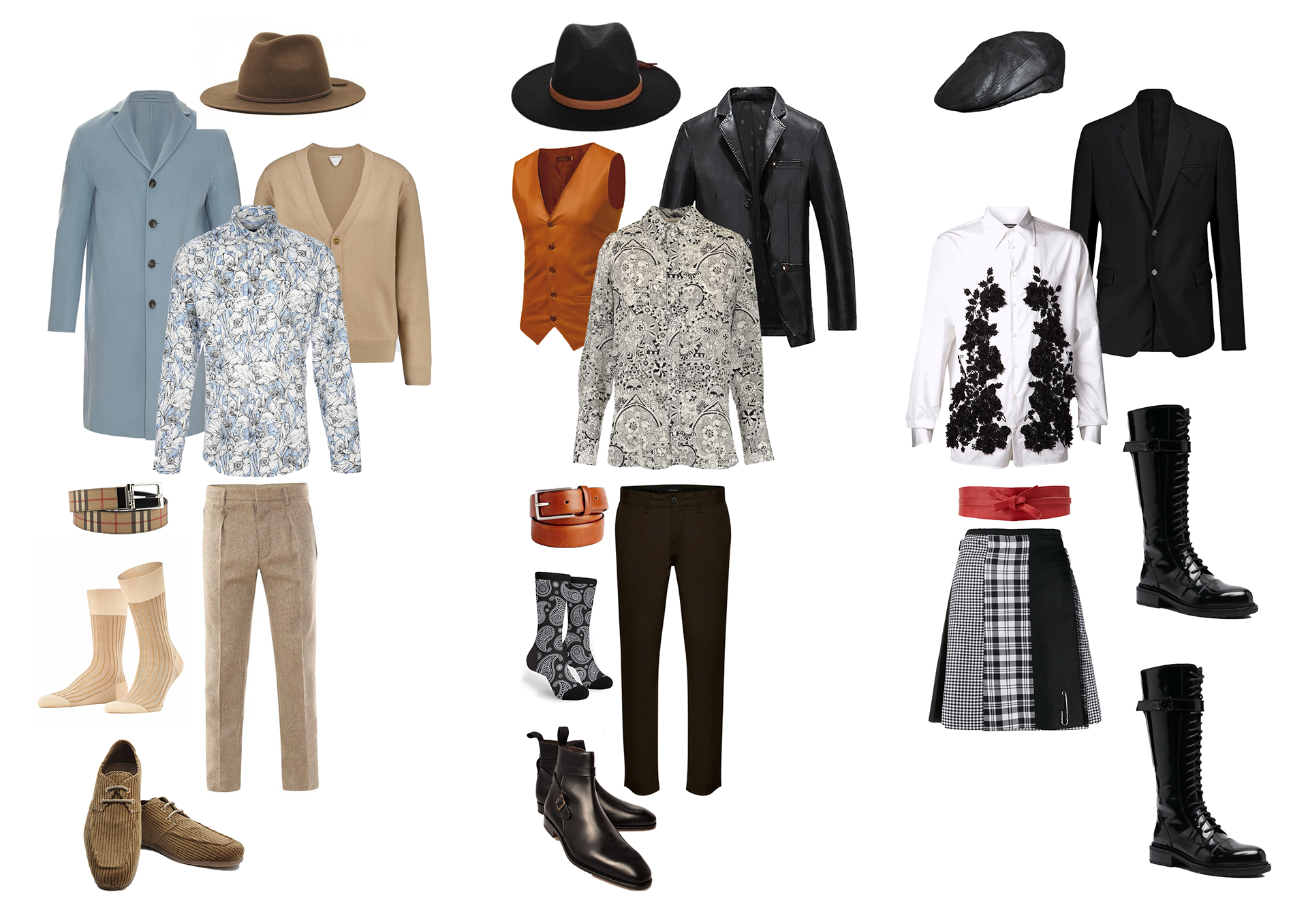
Jimi Hendrix loved the orient and used to wear beautiful kimonos. In the second set, I created a look for the traveling businessman, adding kimono in place of a formal blazer.
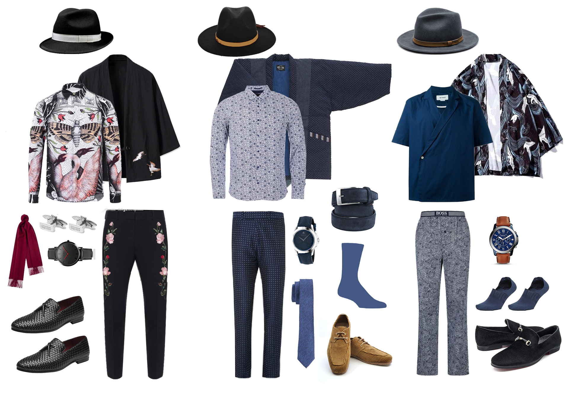
Third set: gentleman "flower power" looks.
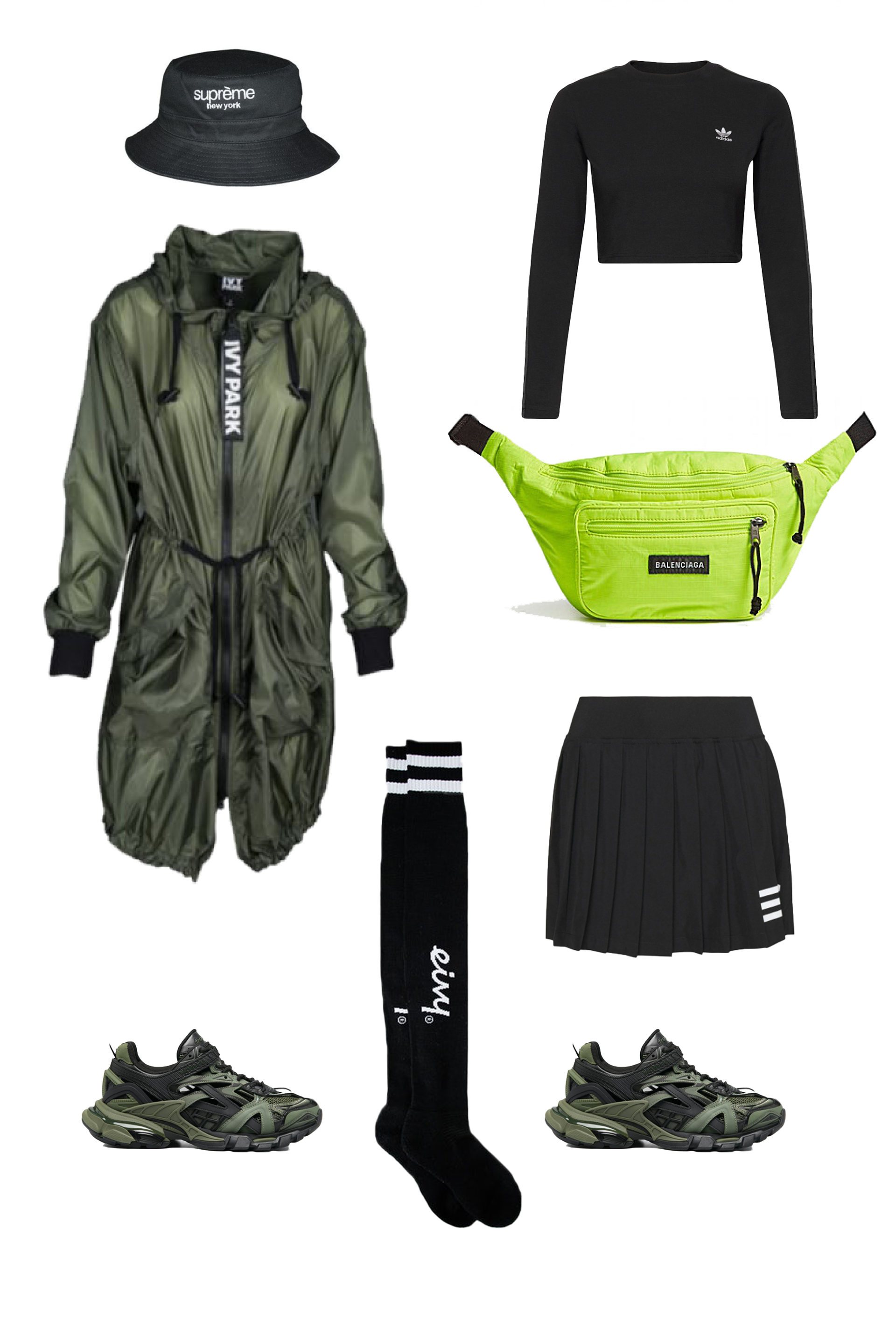
CAMOUFLAGE
School project 2018.
COLOR WHEEL
School project 2017.
Primary and secondary color pallete.
Primary and complementary color pallete.
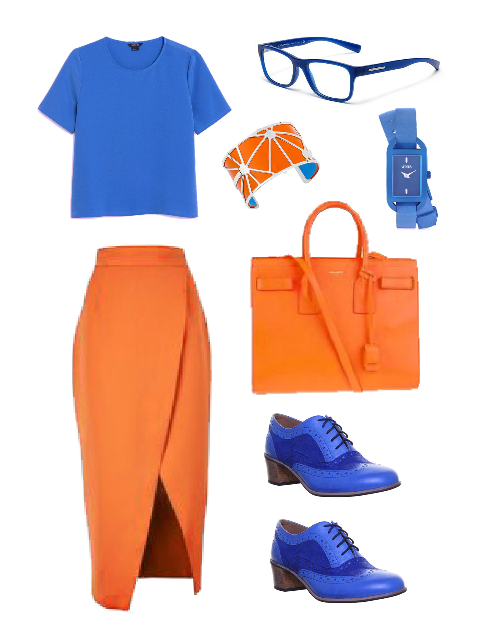
To the left primary and complementary color pallete.
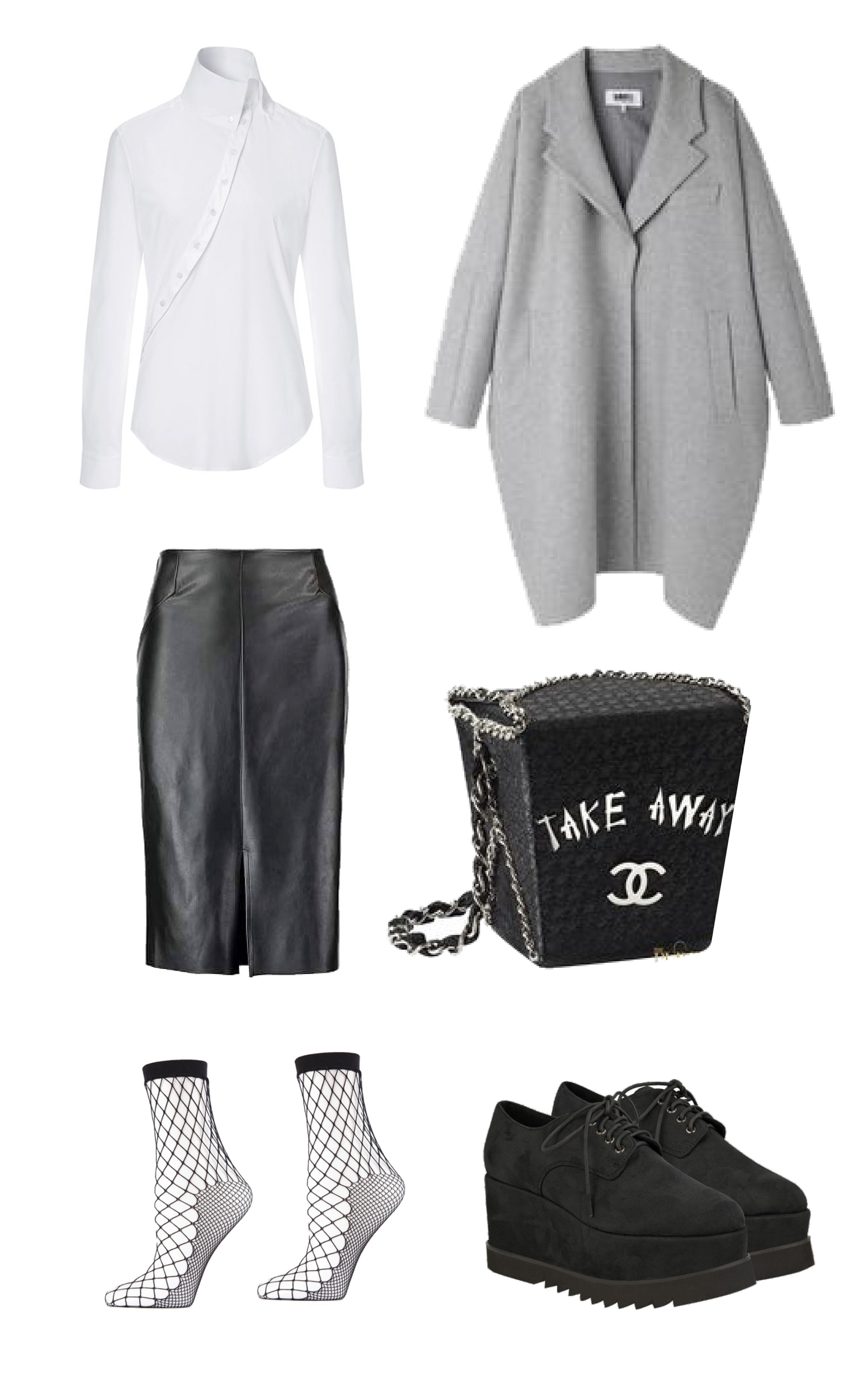
To the right achromatic color pallete.
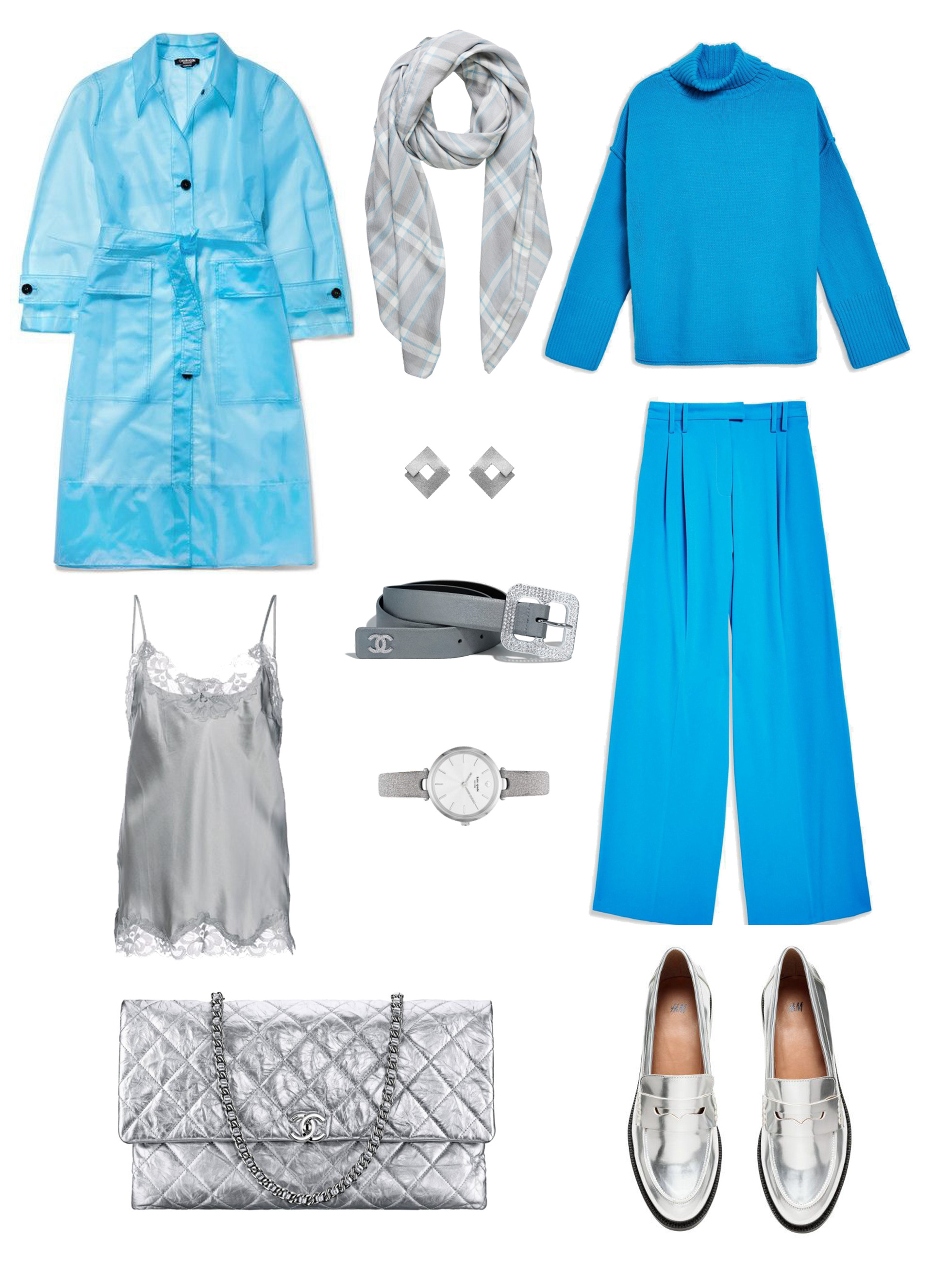
To the left cool color pallete.
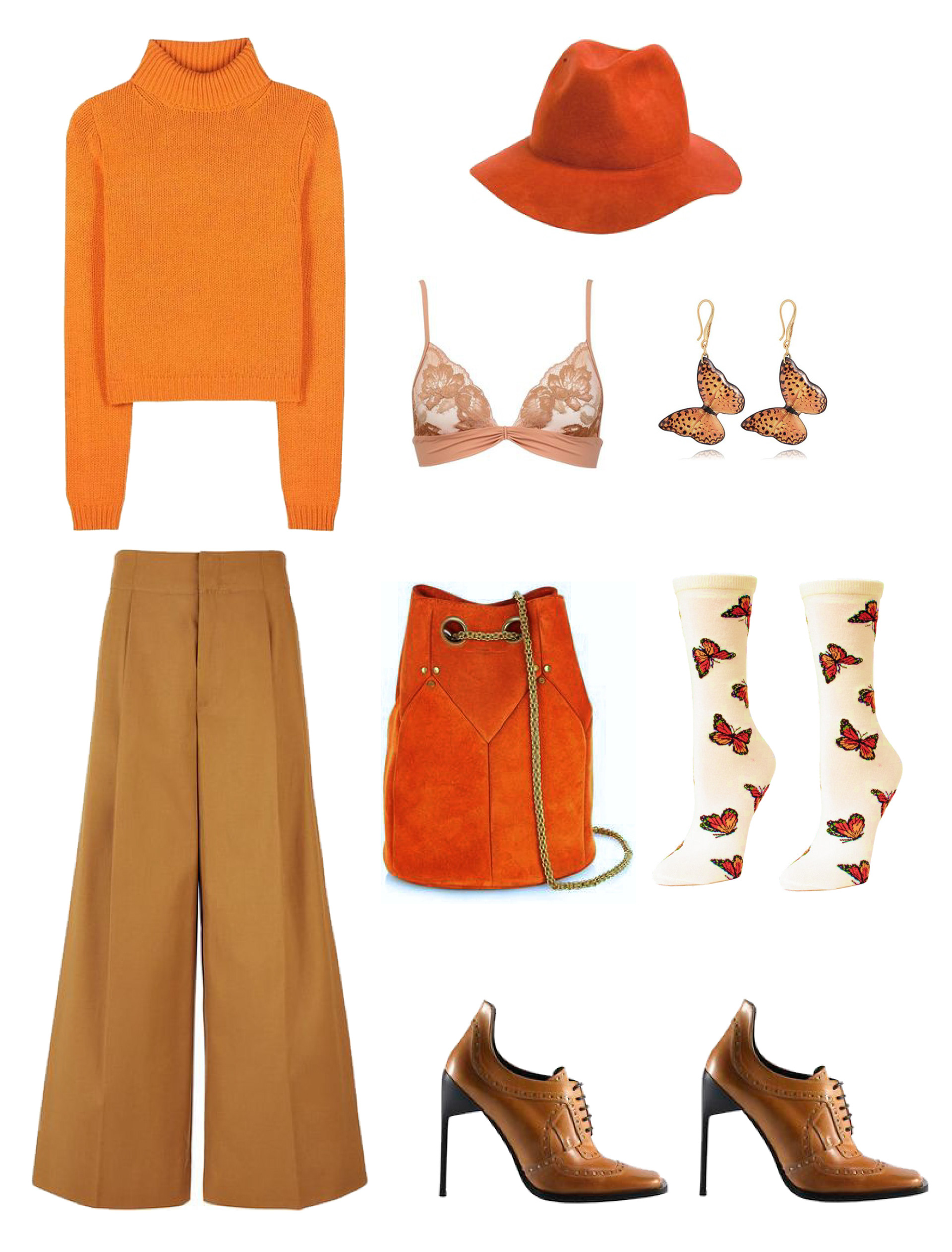
To the right warm color pallete
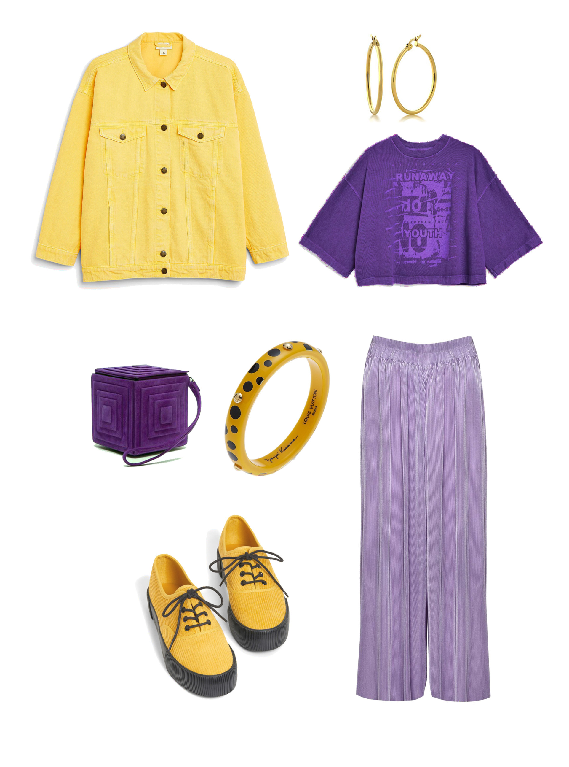
To the left bright color pallete.
To the right muted color pallete.
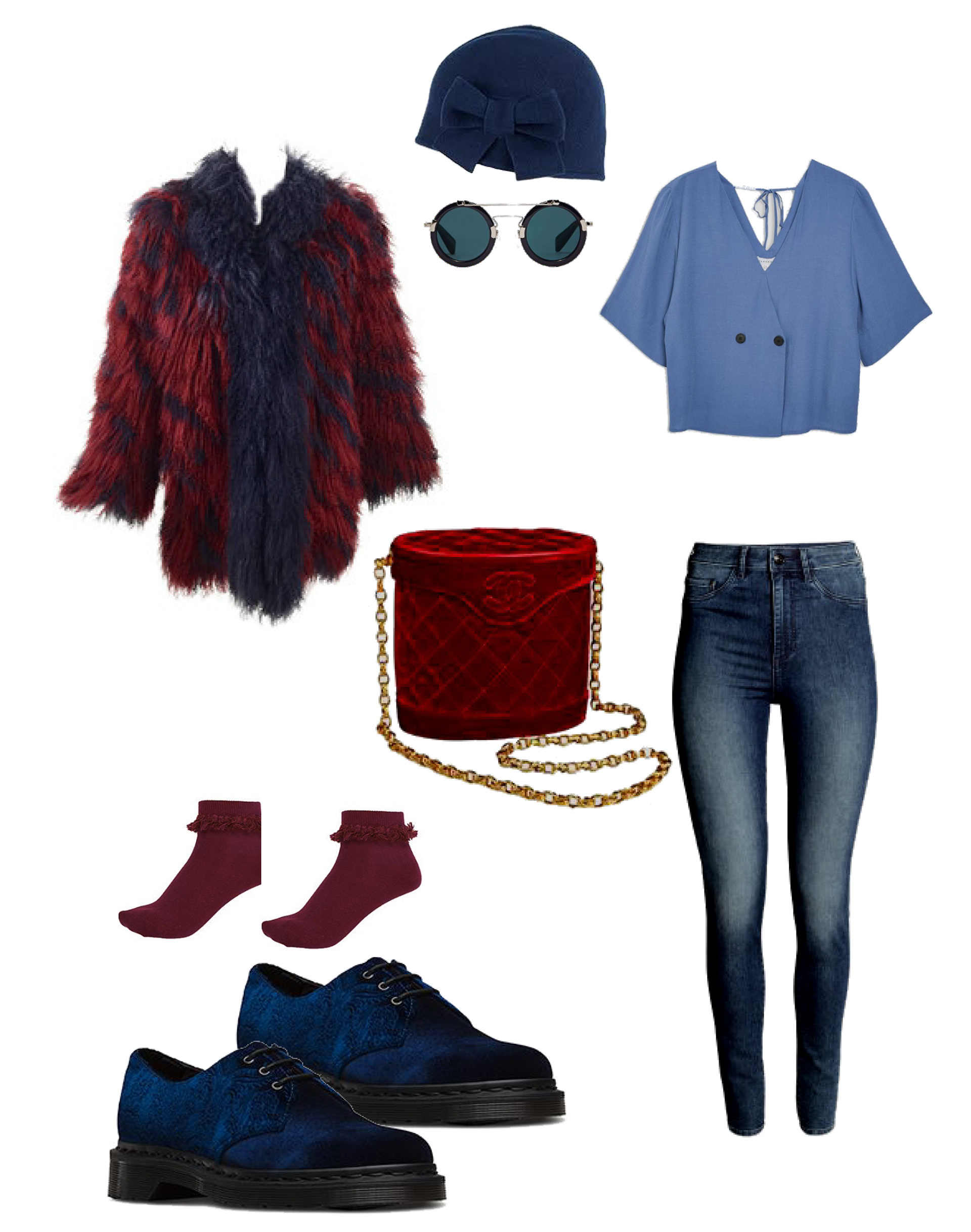
To the left color accent.
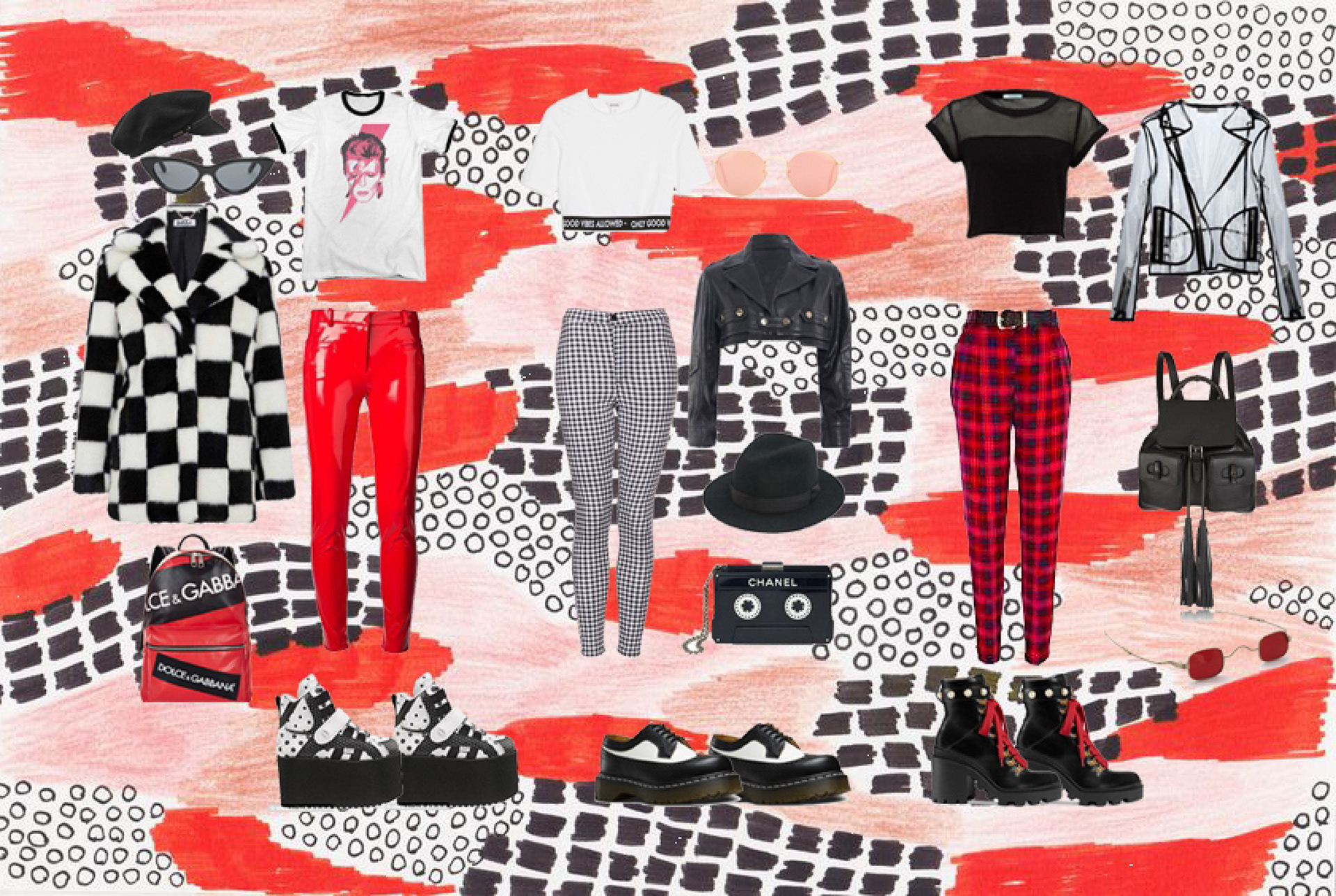
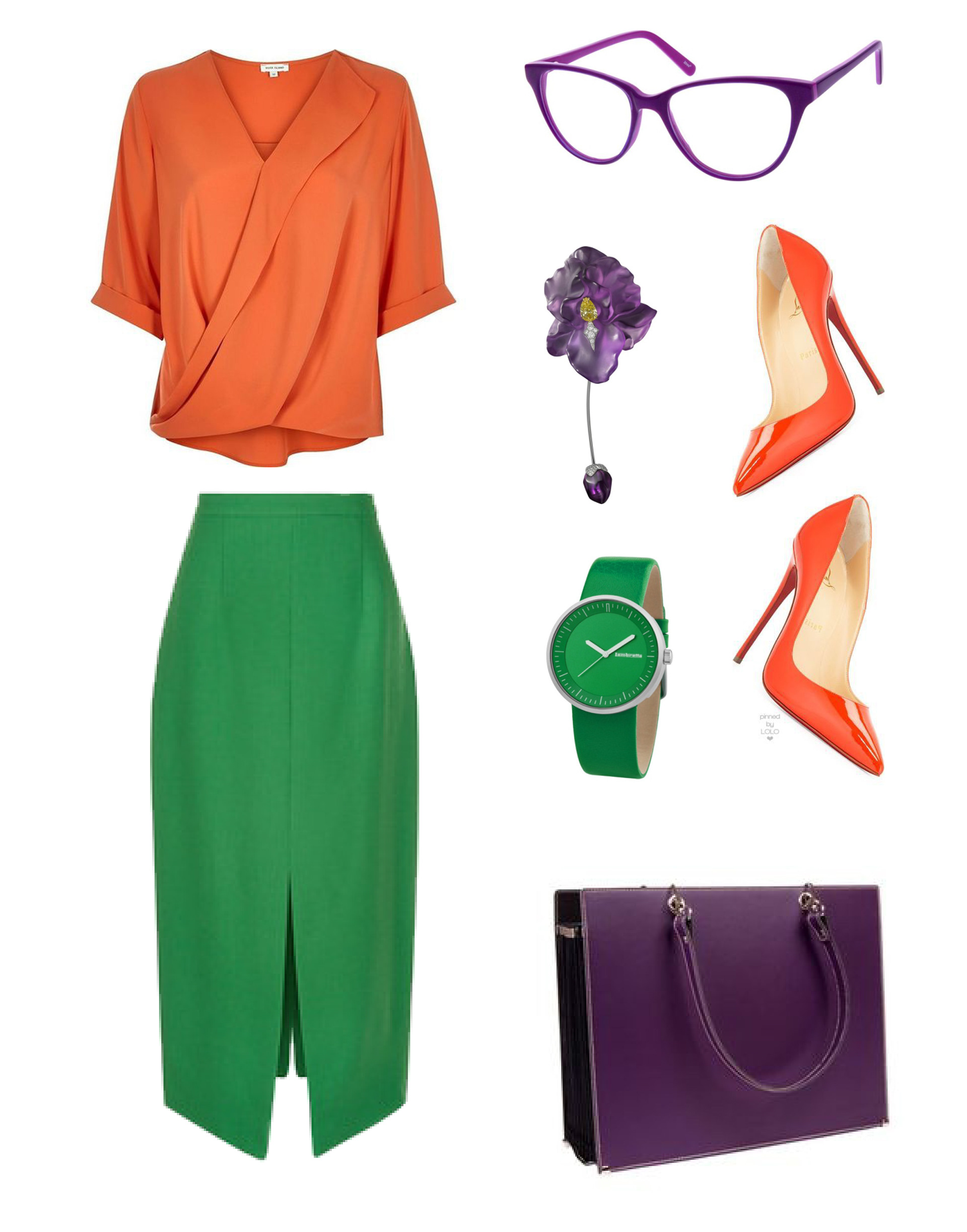
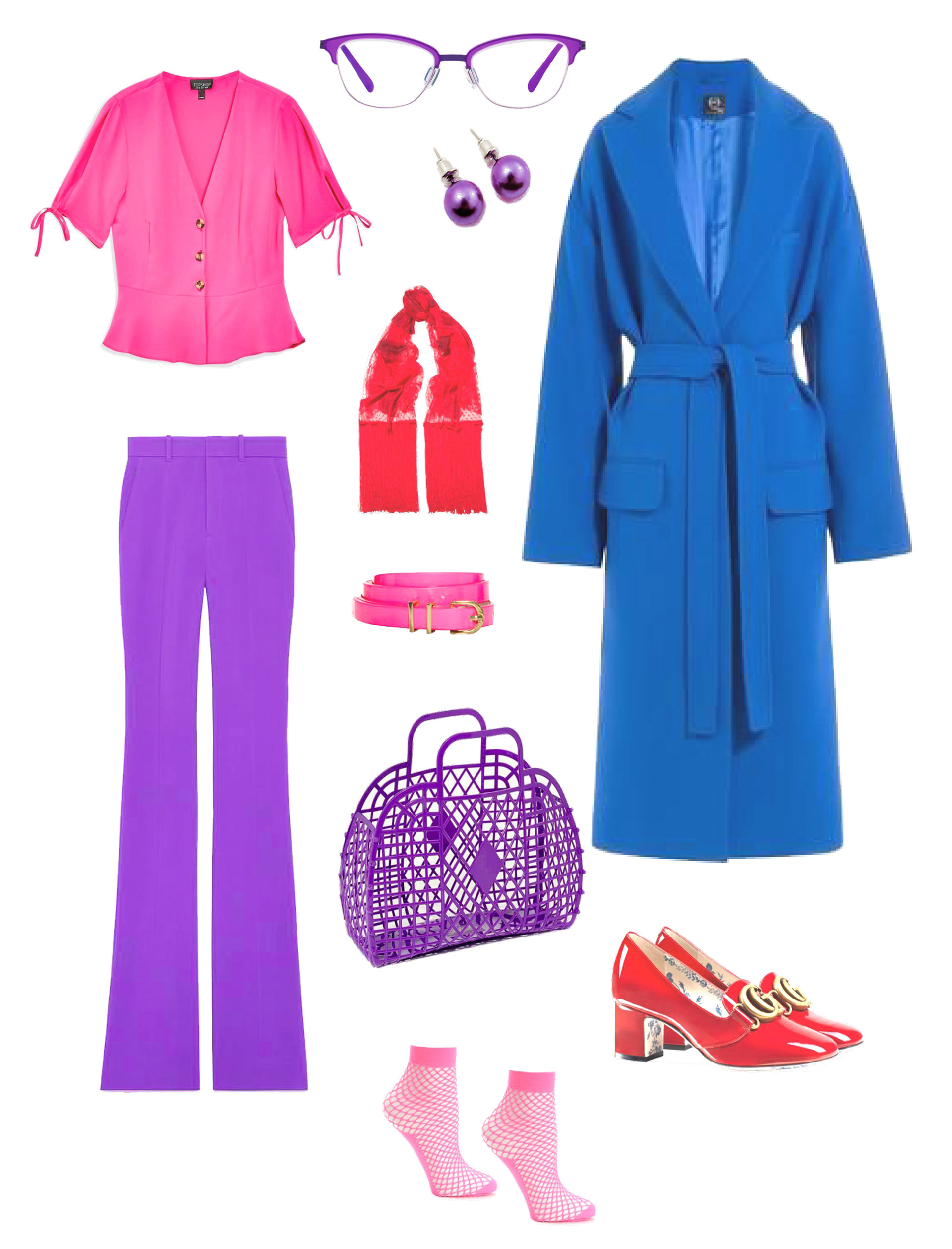
To the right contrast color pallete.
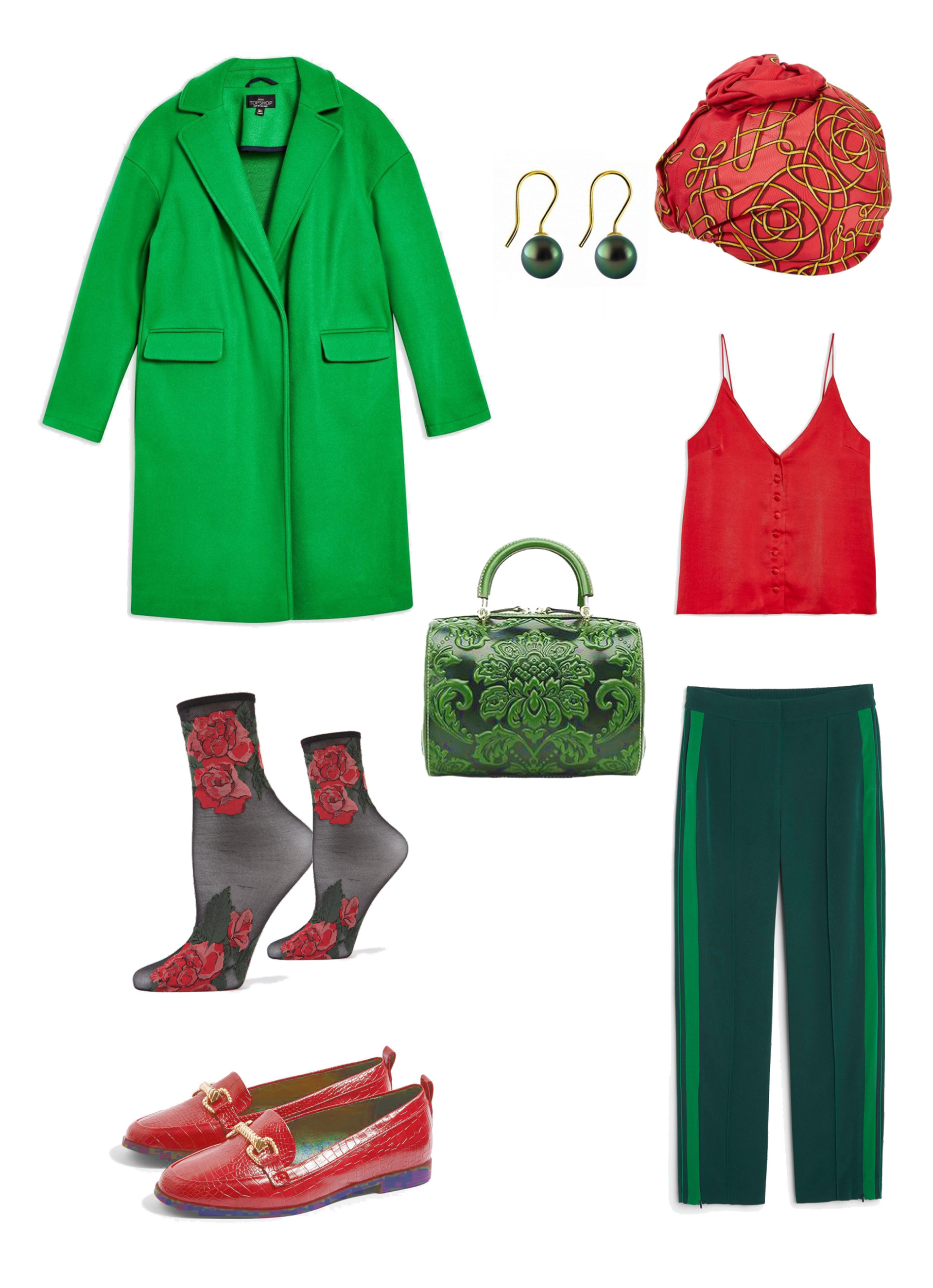
To the left earthtones color pallete.
To the right pastel color pallete.
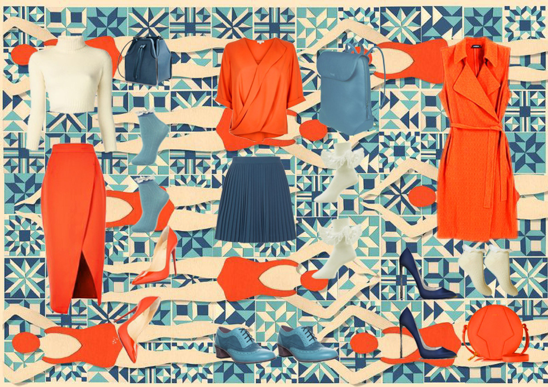
Color pallete inspired by architecture.
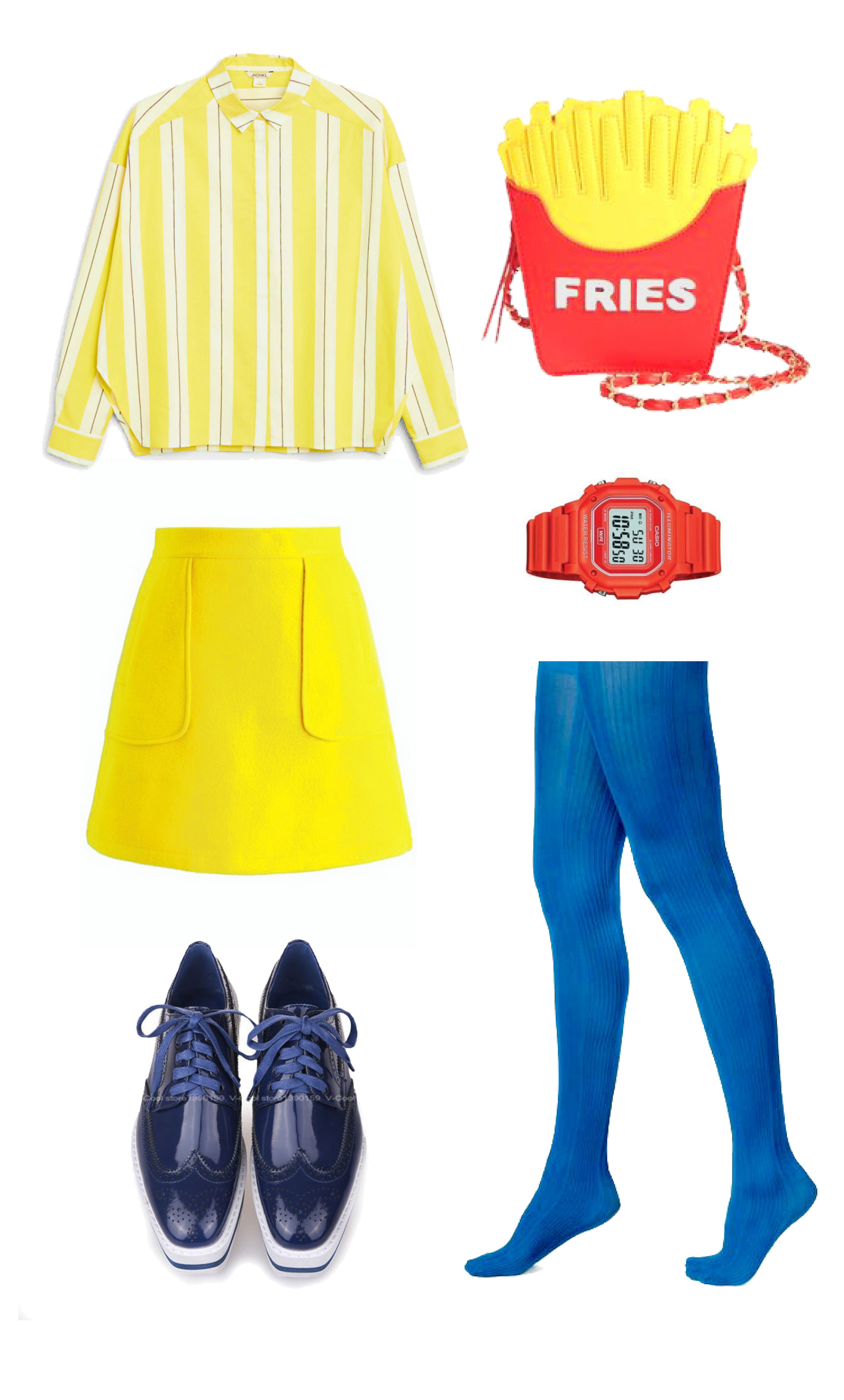
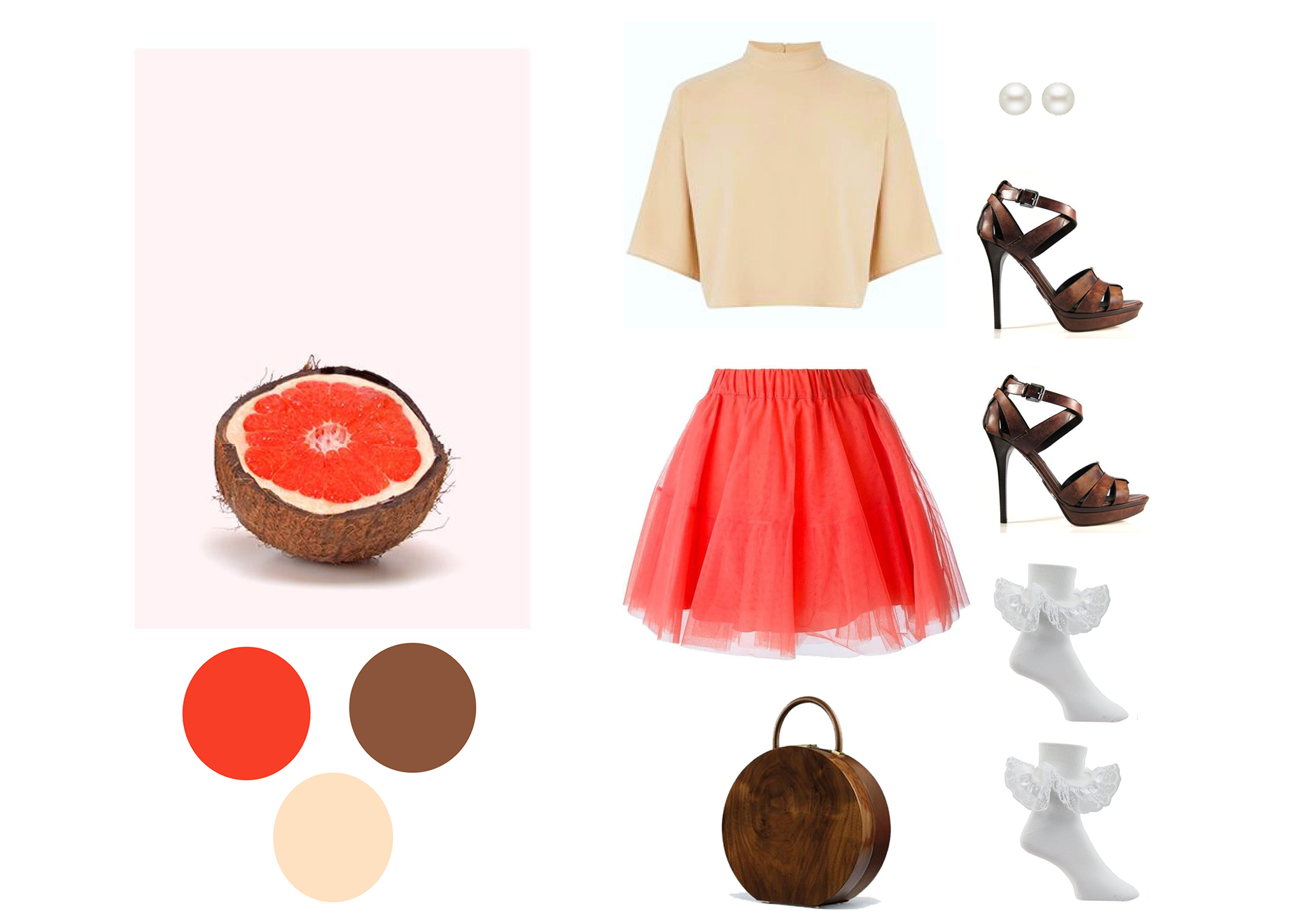
Color pallete inspired by food.
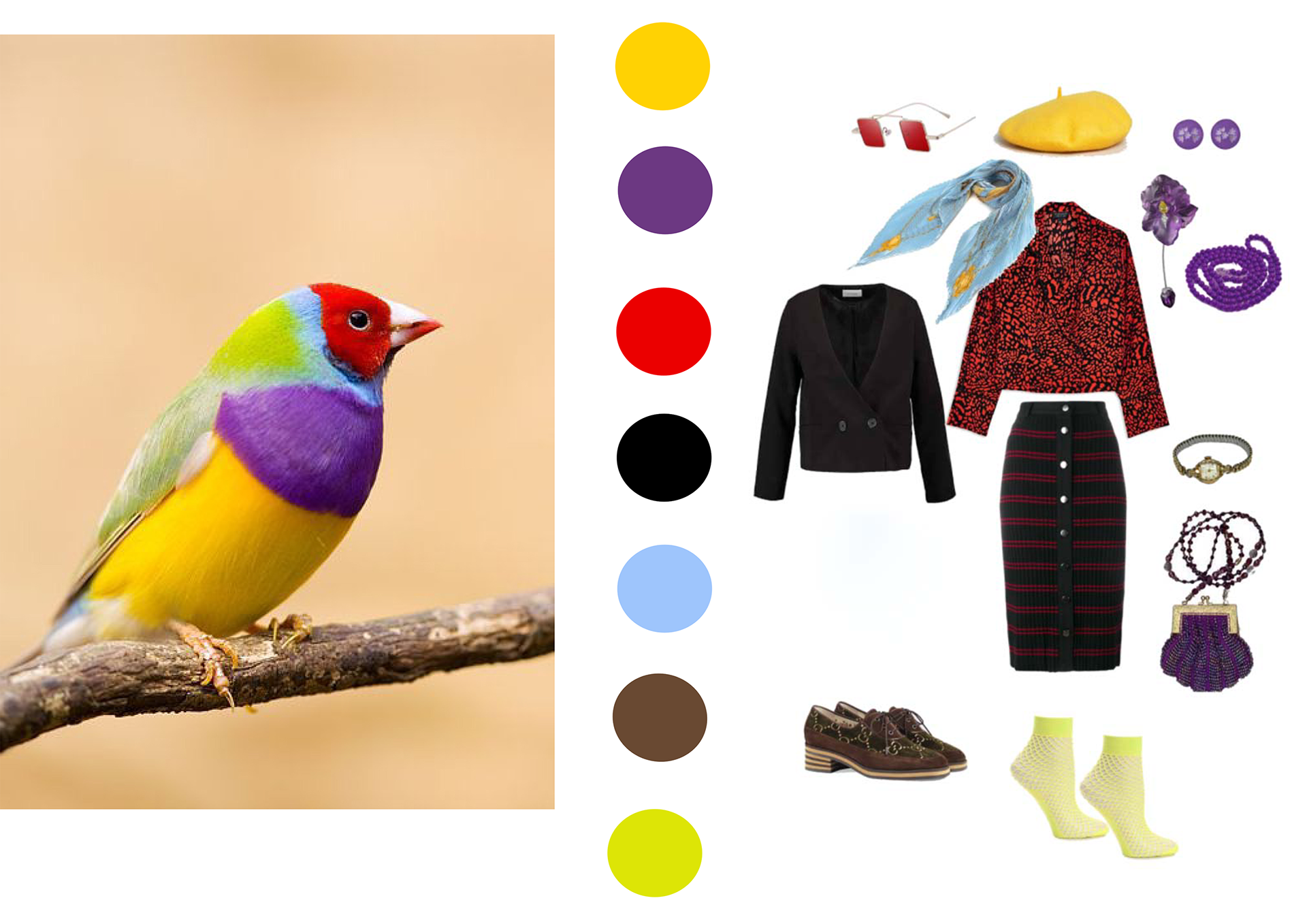
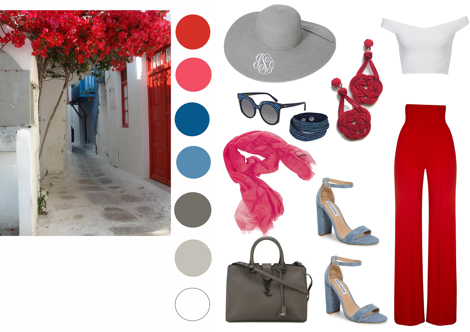
Color pallete inspired by nature.